Table of contents
Adding to HTML
Inline
<h2>Inline CSS Example</h2>
<p>
    Thanks to <span style="color: #FF7A59">inline</span> CSS, I can change the
    color of a word in a paragraph.
</p>
Internal
<!doctype html>
<html>
<head>
    <style>
        p {
            color: #ff7a59;
        }
    </style>
</head>
<body>
<h2>Internal CSS Example</h2>
<p>
    The default text color for the page is black. However I can change the
    color of every paragraph element on the page using internal CSS.
</p>
<p>
    Using internal CSS, I only need to write one rule set to change the color
    of every paragraph elemnet.
</p>
<p>
    With inline CSS, I'd have to add a style attribute to every single
    paragraph in my HTML.
</p>
</body>
</html>
External
div {
    background-color: #eaf0f6;
    color: #33475b;
    border: 3px solid #00a4bd;
    padding: 5px;
}
<!doctype html>
<html>
<head>
    <link
            rel="stylesheet"
            type="text/css"
            rel="noopener"
            target="_blank"
            href="mystyle.css"
    />
</head>
<body>
<div>
    <h1>External CSS Example</h1>
    <p>
        In the external stylesheet, the div is styled to have a background
        color, text color, border, and padding.
    </p>
</div>
</body>
</html>
Pseudo-classes / JS Events / Styles
A CSS pseudo-class is a keyword added to a selector that specifies a special state of the selected element(s). For
example, the pseudo-class :hover
can be used to select a button when a user’s
pointer hovers over the button and this selected button can then be styled.
Hover
a:hover {
    background-color: gold;
}

/* Any button over which the user's pointer is hovering */
button:hover {
    color: blue;
}

#myID:hover {
    transform: scale(2);
}
Any Hover / any-hover /
@media (any-hover: hover) {
    a:hover {
        background: yellow;
    }
}
Hide Element
Display:none - Dynamic Pages/Sections: use this generally for larger dynamic areas on the page to avoid leaving an awkward blank area that makes the page look bad. When displayed it will move the other parts of the page and render itself in the page where its designed to be, altering the position and flow of the surrounding page elements as needed/designed.
Visibility:hidden - Static Pages/Sections: use this for smaller pieces where having the surrounding elements move when this piece becomes visible is undesirable, i.e.: showing/hiding a badge in a page section. Using display:none could/would force itself into the section of the page and move its surrounding elements to make room for itself, resulting in movement on the page. Using visibility:hidden in that case would hide/show the "badge" element without any movement of the rest of the surrounding page elements as that space had been "preserved/reserved" for it, therefore, it just "turns it on/off" without any visible movement.
Visibility:hidden - Static Pages/Sections: use this for smaller pieces where having the surrounding elements move when this piece becomes visible is undesirable, i.e.: showing/hiding a badge in a page section. Using display:none could/would force itself into the section of the page and move its surrounding elements to make room for itself, resulting in movement on the page. Using visibility:hidden in that case would hide/show the "badge" element without any movement of the rest of the surrounding page elements as that space had been "preserved/reserved" for it, therefore, it just "turns it on/off" without any visible movement.
html {
    display: none;

    /*(don't show, but still hold the space)*/
    visibility: hidden;

    opacity: 0;
    width: 0;
    height: 0;
}
opacity and z index to hide
.yourElement {
    z-index: -99999; /* this make sure the element go behind everything */
    opacity: 0; /* reduce opacity */
}
invisible, but with absolute positioning off the left of the screen:
#yourelement {
    visibility: hidden;
    position: absolute;
    left: -1000px;
    width: 1px;
    height: 1px;
    overflow: hidden;
}
make element transparent
#invisible {
    background: transparent;
    color: transparent;
    border: none;
}
CSS Display Syntax
Display CSS Property
html {
    /* precomposed values */
    display: block;
    display: inline;
    display: inline-block;
    display: flex;
    display: inline-flex;
    display: grid;
    display: inline-grid;
    display: flow-root;

    /* box generation */
    display: none;
    display: contents;

    /* multi-keyword syntax */
    display: block flow;
    display: inline flow;
    display: inline flow-root;
    display: block flex;
    display: inline flex;
    display: block grid;
    display: inline grid;
    display: block flow-root;

    /* other values */
    display: table;
    display: table-row; /* all table elements have an equivalent CSS display value */
    display: list-item;

    /* Global values */
    display: inherit;
    display: initial;
    display: revert;
    display: revert-layer;
    display: unset;
}
Visibility CSS Property
The content-visibility CSS property controls whether or not an element renders its contents at all, along with forcing a strong set of containments, allowing user agents to potentially omit large swathes of layout and rendering work until it becomes needed. It enables the user agent to skip an element's rendering work (including layout and painting) until it is needed — which makes the initial page load much faster.
html {
    /* Keyword values */
    visibility: visible;
    visibility: hidden;
    visibility: collapse;

    /* Global values */
    visibility: inherit;
    visibility: initial;
    visibility: revert;
    visibility: revert-layer;
    visibility: unset;
}
Content Visibility CSS Property
html {
    /* Keyword values */
    content-visibility: visible;
    content-visibility: hidden;
    content-visibility: auto;

    /* Global values */
    content-visibility: inherit;
    content-visibility: initial;
    content-visibility: revert;
    content-visibility: revert-layer;
    content-visibility: unset;
}
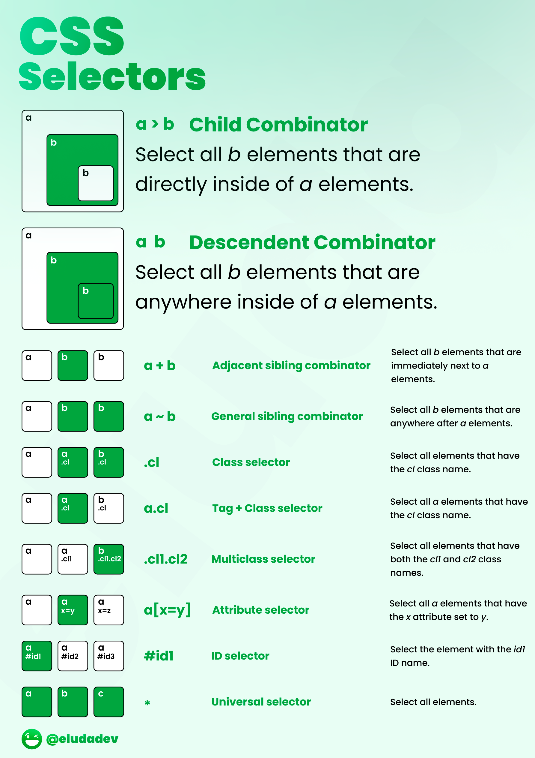
Selectors